Category Archives: Mobile Phones

21.5 Hours Without Power: Which Phone Got Used the Most?

The area I live in lost power last night at 6:30pm. Power wasn’t restored until 3pm this afternoon (21.5 hours later).

My landline stayed up, of course. So, communications was not a huge problem. My neighbor’s cable TV provide voice phone went down right away (also “of course”).

T-Mobile data services stayed up for a little while (under an hour perhaps?) but went down and stayed down until after power was restored. Since all my Windows Mobile smartphones and the Nokia N96 I’m using at the moment are on that service (1 SIM card that moves from device to device), that left the iPhone on AT&T Wireless’ service.

I didn’t have a chance to recharge the iPhone before the power outage started. But, fortunately, I had a pretty good charge. I turned off WiFi (GPS & Bluetooth were already turned off) to conserve the battery’s charge. I only used the iPhone sparingly over the next 21.5 hours often setting it to flight mode to maximize battery life.

More in my MobileAppsToday blog on this topic later.

Testing ShoZu with an iPod touch


Hope this works

Posted by ShoZu


Everything above the line above this sentence was created and sent from the ShoZu photo and video web service that claims to add value by being able to post media from mobile devices to numerous other media web services and blogs. It half-worked posting a photo from my iPod touch to this blog. But, the image doesn’t display at all here. It worked ok with Flickr, however. Check my MobileAppsToday.com blog for more details on the showdown with ShoZu.

Watch NBCOlympics.com Video Clips on Your Phone (iPhone too!)


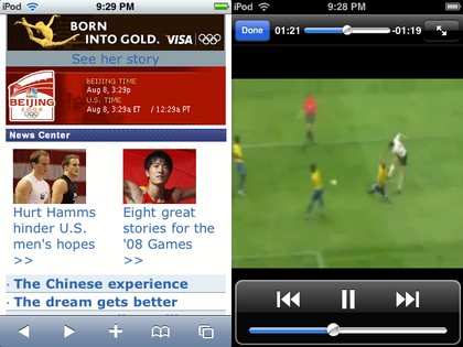
Everyone probably knows about the Microsoft Silverlight-powered NBCOlympics.com site. But, did you know you can access its information AND videos on your smartphone too? Yep, head over to…

mobile.nbcolympics.com

I tested video playback on my iPod touch and found that it works fine. So, iPhone users will not be left out of the Olympics this summer.

Back to Basics: The Mobile Browsing Experience


Most web pages are designed to be viewed on a desktop or notebook computer. Looking at these pages on a small screen phone is like looking at a mountain range through a pinhole. It is not a good viewing experience. Some web site owners and designers now understand that many people look at their pages on-the-go on their phones and other small screen mobile devices. Unfortunately, there are tremendous differences between the various browsers on various devices.

My first web-enabled phone had a monochrome display that placed black characters on a green-ish tinted background like the green-screen CRTs from decades ago. It supported the Wireless Access Protocol (WAP) which simply placed characters on the tiny screen and assumed your main input was a 12-key phone keypad. These days it is still considered the most basic format supported and you still see addresses like wap.ao.yahoo.com. It has the advantage of being lightning fast because it is usually text with little formatting. It also works on almost every mobile device running today.

Many of today’s so-called smartphones use mobile versions of familiar desktop browsers such as Internet Explorer and Opera. These smartphone browsers often are missing some of the functions of their desktop counterparts but can deliver a limited but still useful web experience if a website is designed for the mobile browsers limitations.

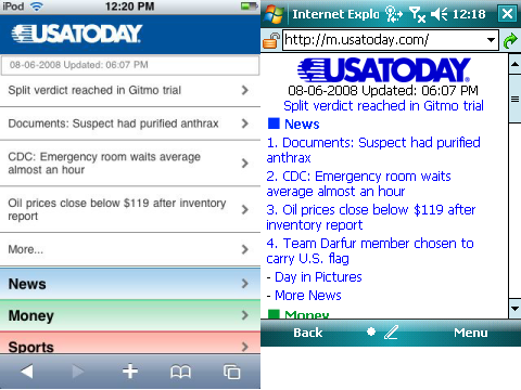
Finally, there are mobile browsers that deliver near desktop experience on a small screen. Opera Mobile and the Apple iPhone’s Safari deliver outstanding mobile web browsing experiences. However, as good as these browser are, the pinhole viewing effect still exists. Fortunately, some websites are now designed to identify the different mobile browser types and deliver optimized web pages for the different platforms. The USA Today newspaper online site is a good example. If you type usatoday.com in an iPhone (or iPod touch) Safari browser, it automatically redirects you to the iphone.usatoday.com site optimized to look and work best with an iPhone. Typing the same usatoday.com on a Windows Mobile smartphone, on the other hand, sends you to the simpler but still useful m.usatoday.com formatted for use with most of the web browsers used by smartphones using various mobile operating systems.

You can see two versions of the same USA Today web home page above. The screen on the left is the page formatted for an iPhone. The screen on the right is formatted for most mobile web browsers. This specific screen capture came from a Windows Mobile Professional Edition smartphone with a touch screen.

Incidentally, the one thing you rarely see is the ill-fated attempt to create mobile specific web domains ending in the .mobi name suffix. The common naming conventions for mobile friendly websites use prefixes such as wap. (wap.oa.yahoo.com), mobile. (mobile.msn.com), and m. (m.digg.com). Sites designed specifically for the iPhone sometimes use the prefix iphone. (iphone.usatoday.com). There are other variants such as a trailing /i path after the domain name (friendfeed.com/i). So, it can be a challenge to figure out what the correct mobile friendly webpage name is if the site does not auto-identify and redirect you to the correctly formatted site as USA Today does.

The good news though is that browsing from your phone or other small screen devices is on the radar of web site ownes and developers. And, it has resulted in a much improved web browsing experience when on the go.

Why it is Hard to ID the “Best” Mobile Device


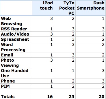
Just for fun I decided to score my iPod touch, TyTn Windows Mobile 6 Pocket PC, and Dash Windows Mobile 6 Smartphone on 10 features. The highest possible score is 3 and the lowest is 1. So, a higher total is theoretically better than a lower one.

If you look at the scores, you might guess that I carry the TyTn Pocket PC around most of the time. Unfortunately, that guess would be wrong. I always take my Dash Smartphone out with me if I am only carrying one device. And, if watched me wander around my home, you would probably see me using the iPod touch.

The reason is that the my unscientific scorecard did not place weights on the ranked features. When, I am running around town, the most important features to me around the voice phone, one-handed use, RSS reader, PIM, and Email. When I am at home the most important features are web browsing and reading (but not writing/responding to) email. Email is a tricky one because when outside of the home I want one device that I can use for both reading and writing email. On the other hand, when I am at home, I just need to be aware of email and can wander over to a desktop or notebook computer to actually compose a response.

The Pocket PC (touch screen) probably trumps the Smartphone (non-touchscreen) with its unweighted score when outside of the home. But, once weight is placed on one-handed use and (a feature I did not rank) durability, the non-touchscreen Smartphone wins. I hated using my phone in the rain when I used a Pocket PC Phone Edition device. I felt that the touch screen technology was just too fragile. The Smartphone, on the other hand, seems to be tough enough for most outdoor weather conditions.

The big problem with the iPod touch and iPhone for my personal use is that they don’t have a physical thumb keyboard. As, I’ve mentioned many times before here, I still can’t type comfortably on iPod touch’s screen keyboard. That is why I never use it to reply to email or tweet on Twitter.

There is no perfect mobile device for me yet. So, I’ll continue to use a couple of best-of-breed devices in different situations for now.