Most web pages are designed to be viewed on a desktop or notebook computer. Looking at these pages on a small screen phone is like looking at a mountain range through a pinhole. It is not a good viewing experience. Some web site owners and designers now understand that many people look at their pages on-the-go on their phones and other small screen mobile devices. Unfortunately, there are tremendous differences between the various browsers on various devices.
My first web-enabled phone had a monochrome display that placed black characters on a green-ish tinted background like the green-screen CRTs from decades ago. It supported the Wireless Access Protocol (WAP) which simply placed characters on the tiny screen and assumed your main input was a 12-key phone keypad. These days it is still considered the most basic format supported and you still see addresses like wap.ao.yahoo.com. It has the advantage of being lightning fast because it is usually text with little formatting. It also works on almost every mobile device running today.
Many of today’s so-called smartphones use mobile versions of familiar desktop browsers such as Internet Explorer and Opera. These smartphone browsers often are missing some of the functions of their desktop counterparts but can deliver a limited but still useful web experience if a website is designed for the mobile browsers limitations.
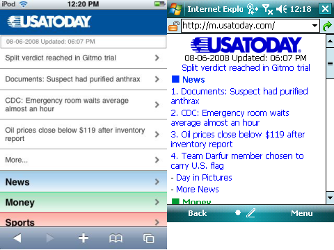
Finally, there are mobile browsers that deliver near desktop experience on a small screen. Opera Mobile and the Apple iPhone’s Safari deliver outstanding mobile web browsing experiences. However, as good as these browser are, the pinhole viewing effect still exists. Fortunately, some websites are now designed to identify the different mobile browser types and deliver optimized web pages for the different platforms. The USA Today newspaper online site is a good example. If you type usatoday.com in an iPhone (or iPod touch) Safari browser, it automatically redirects you to the iphone.usatoday.com site optimized to look and work best with an iPhone. Typing the same usatoday.com on a Windows Mobile smartphone, on the other hand, sends you to the simpler but still useful m.usatoday.com formatted for use with most of the web browsers used by smartphones using various mobile operating systems.
You can see two versions of the same USA Today web home page above. The screen on the left is the page formatted for an iPhone. The screen on the right is formatted for most mobile web browsers. This specific screen capture came from a Windows Mobile Professional Edition smartphone with a touch screen.
Incidentally, the one thing you rarely see is the ill-fated attempt to create mobile specific web domains ending in the .mobi name suffix. The common naming conventions for mobile friendly websites use prefixes such as wap. (wap.oa.yahoo.com), mobile. (mobile.msn.com), and m. (m.digg.com). Sites designed specifically for the iPhone sometimes use the prefix iphone. (iphone.usatoday.com). There are other variants such as a trailing /i path after the domain name (friendfeed.com/i). So, it can be a challenge to figure out what the correct mobile friendly webpage name is if the site does not auto-identify and redirect you to the correctly formatted site as USA Today does.
The good news though is that browsing from your phone or other small screen devices is on the radar of web site ownes and developers. And, it has resulted in a much improved web browsing experience when on the go.